Arranging and decorating a home is not just about choosing a sofa and repainting a wall. Each room functions as a system where light, proportions, materials, and circulation interact. Understanding these mechanisms allows for the creation of a stylish interior without relying on fleeting trends.
Proportions and circulation: the invisible foundation of a successful layout
Before thinking about colors or furniture, the layout of the space dictates everything else. A living room cluttered with oversized furniture will always feel cramped, even with careful decoration. The basic rule: leave clear circulation areas between each element.
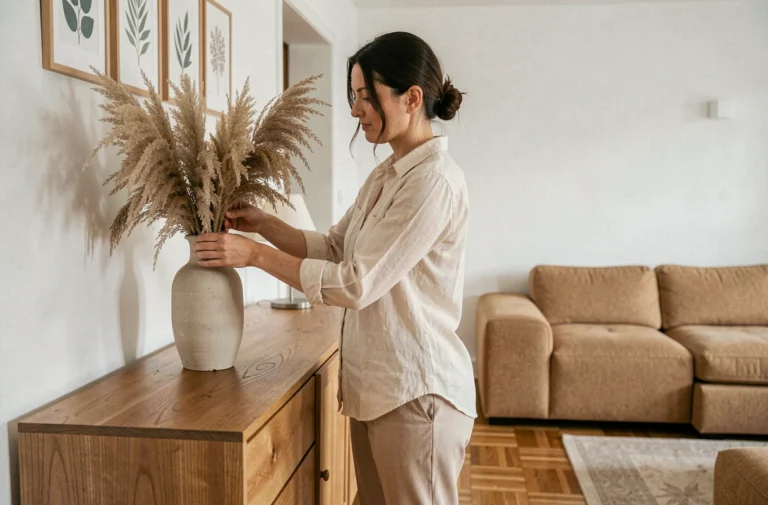
Furniture should not always line the walls. Pulling a sofa or console a few centimeters away creates visual breathing space and gives the impression of a more generous area. In a living room, positioning the sofa slightly away from the back wall structures the room into two distinct zones without partitions.
To test a layout before buying anything, tools like HomeByMe allow you to model a room based on its actual dimensions and place virtual furniture within it. Some platforms even use artificial intelligence to generate layout proposals from a simple photo.
This projection step helps avoid costly mistakes regarding dimensions or color combinations. To explore concrete configurations by room, you can access the Perspective Maison website and compare approaches suited to each space.
Materials and textures: creating contrast in every room
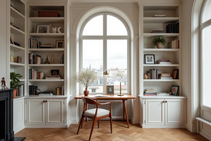
A monotonous interior rarely stems from a poor color choice. The issue often lies in the lack of contrast between materials. A room fully furnished in light wood, without any texture break, produces a flat effect, even if each piece of furniture is well chosen individually.
Contrast works through opposing material families:
- Raw wood or rattan brings warmth but benefits from being paired with a metallic element (brass lighting, black steel table legs) to create visual tension.
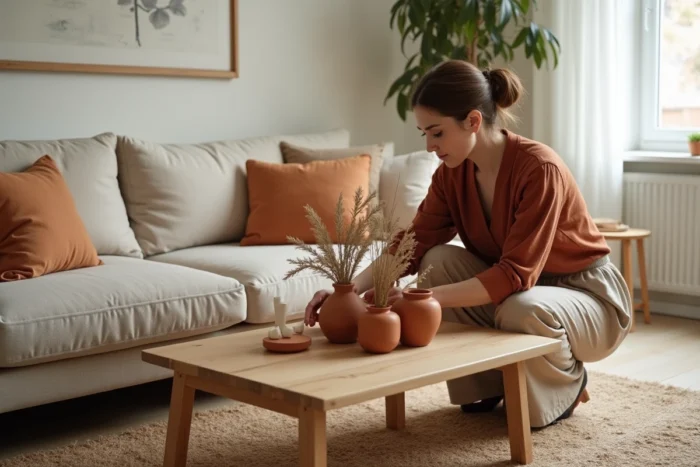
- Thick textiles (wrinkled linen, corduroy, boucle wool) break the coldness of smooth surfaces like polished concrete or large-format tiles.
- Reclaimed or second-hand materials introduce a patina and irregularity that new furniture cannot replicate.
This approach aligns with an underlying trend towards sustainable decoration, where the choice of artisanal, recycled, or local materials replaces the race for standardized furniture. A turned wood stool found at a flea market has more presence in a living room than an identical piece found in thousands of other homes.
Retro comfort versus minimalism: choosing a cohesive decor thread
In recent years, white and minimalist styles have been declining in French interiors. Several specialized media outlets, including Maison & Travaux, have documented the rise of retro styles focused on comfort: textured carpets, colored glass, rounded furniture shapes, warm color palettes.
The retro comfort style prioritizes detail and intimacy over radical sobriety. This translates into the return of elements like the pantry in the kitchen or the veranda as an extension of the living room, features long considered outdated.
Minimalism remains relevant in small spaces where storage constraints impose discipline. A studio benefits from limiting visible objects. However, in a house with multiple rooms, applying the same stripped-down treatment everywhere often results in a cold and impersonal interior.
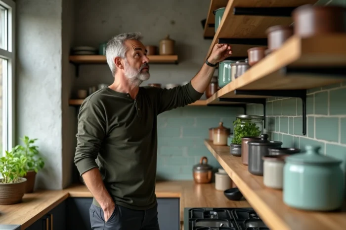
The real choice is not between two opposing camps. It’s about defining a coherent thread: a limited color palette, a dominant type of material, an acknowledged relationship with comfort. An interior that mixes too many styles without any connection appears not original, but indecisive.
Colors and natural light: adapting decoration to exposure
The choice of a wall color is not made from a color chart in a store. The same shade changes radically in appearance depending on the room’s orientation and the time of day.
A north-facing bedroom receives cold, diffuse light. Warm shades (terracotta, yellow ochre, old rose) compensate for this coldness without darkening the space. Conversely, a south-facing living room bathed in direct light can support deeper colors (sage green, teal, anthracite gray) that won’t appear dark due to the sunlight.
- Test the color directly on the relevant wall, on a surface of at least one square meter, and observe it at different times.
- Avoid painting all four walls a strong color in a low-light room: one wall is enough to structure the space.
- Pair a colored wall with accent lighting (table lamp, wall sconce) to control the ambiance in the evening when natural light fades.
Artificial light also alters the perception of materials. Light wood under cold white LED lighting appears dull, while a warm temperature bulb reveals its nuances. Lighting is an integral part of decoration, not just a functional aspect.
Arranging with style and originality relies less on the accumulation of decorative objects and more on mastering a few structuring principles: respected proportions, material contrasts, an acknowledged thread, and lighting suited to each room. The last repainted wall or the last repositioned piece of furniture can sometimes change the atmosphere of an interior more than a new purchase.