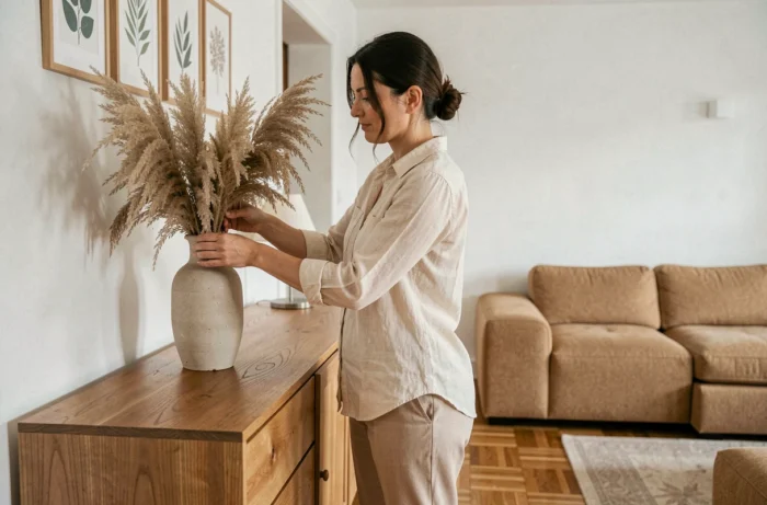
Designing a house with style involves simultaneously addressing three technical aspects: indoor air quality related to finishing materials, thermal balance between insulation and summer comfort, and the coherence of color-material palettes room by room. Neglecting any of these aspects results in an interior that looks appealing in photos but is uncomfortable to live in daily.
Emission Labels and Material Choices: The Invisible Criterion in Interior Decoration
A decor project often begins with paint, wallpaper, or flooring. Color and texture capture attention, but the emission class of volatile pollutants (from A+ to C in France) determines the air quality in the renovated room. A living room repainted with a product rated C releases more volatile organic compounds than an A+ product, with measurable effects on respiratory comfort.
In practice, this label appears on paint cans, adhesives, varnishes, and flooring materials. We recommend systematically checking this information before approving a color sample. This information is often absent from online decor inspirations, which focus on visual appeal.
To explore design options beyond mere aesthetics, you can visit the Conceze website and browse the sections dedicated to home.
This criterion also applies to reconstituted wood panels used in custom libraries or wall coverings. A raw particle board emits more than a certified E1 panel or one covered with low-emission laminate. Style is not compromised: matte, satin, or textured finishes exist in all classes.
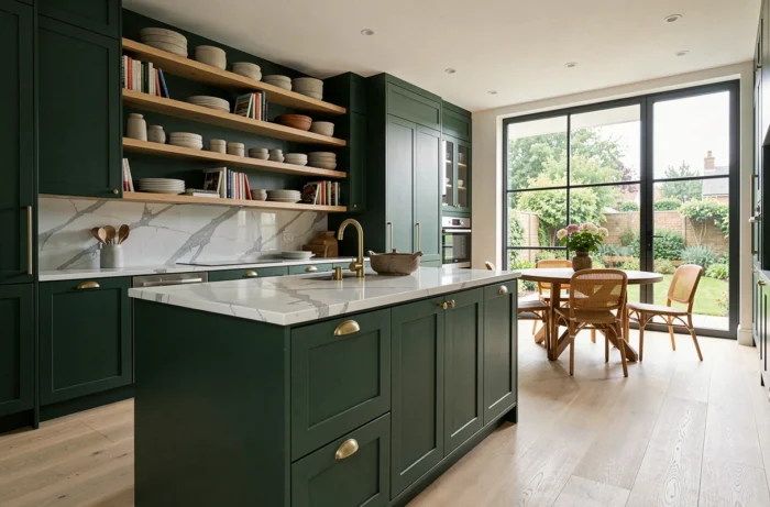
Summer Comfort and Insulation: A Balance to Strike Before Decorating
Decorating a recently insulated house without considering summer comfort risks creating a stuffy interior from June to September. An analysis reported by Modes & Travaux, based on several hundred thousand energy audits of homes, indicates that some renovation scenarios can worsen indoor heat in summer. The outcome depends on the type of work and the initial structure.
For layout, this changes the game. Blackout curtains, interior shutters, the choice of exterior blinds, or adjustable sunshades are not just decorative accessories. They are thermal regulation elements that directly influence comfort in a living room or bedroom.
Materials and Colors to Favor in Overheating Areas
Light shades on interior surfaces (walls, ceilings) reflect more light and limit the accumulation of perceived heat. Solid wood, due to its moderate inertia, regulates humidity better than a thin melamine panel.
- A lime plaster on an old wall absorbs and releases moisture, tempering the sensation of heat in south or west-facing rooms.
- Cement tiles or natural stone in kitchen and bathroom flooring provide a cool touch that laminate flooring does not.
- Textiles made of linen or thick cotton for curtains and cushions remain more pleasant in summer than polyester, which retains heat.
Before choosing a style (Scandinavian, Japandi, industrial), it is better to map out the rooms exposed to overheating and adjust the material palette accordingly.
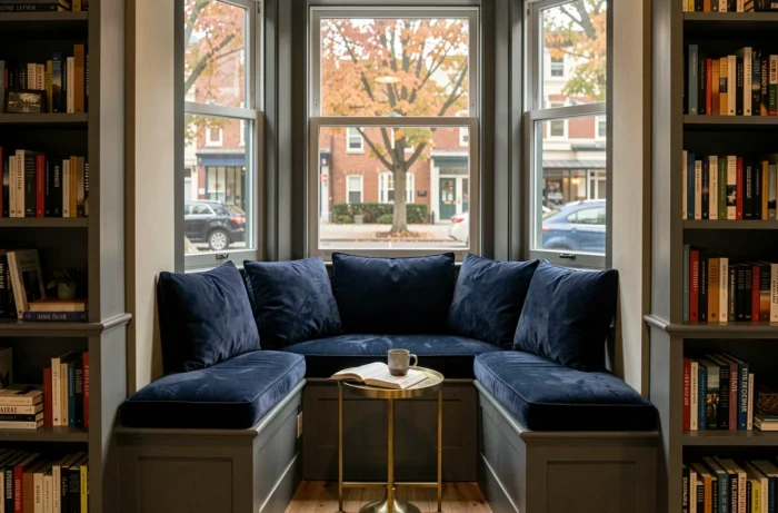
Repurposing Furniture: Structuring an Interior with Second-Hand Pieces
Repurposing goes beyond just Sunday flea markets. Organized channels, supported by social and solidarity economy structures, offer furniture sourced from hotel de-stocking or tertiary renovations. These pieces (chairs, tables, lighting) come with a usage history and sometimes a technical sheet, distinguishing them from furniture purchased privately without a guarantee of condition.
In interior decoration, integrating repurposed furniture helps break the uniformity of a new layout. A solid oak refectory table, recovered through a structured channel, adds character that mass-produced furniture cannot replicate. The mix of new and repurposed pieces creates a visual tension that adds depth to a living room or dining area.
Points of Caution Before Integrating Repurposed Furniture
Check dimensional compatibility: a deep hotel buffet can overwhelm a narrow hallway. Also, check the finishes (varnish, lacquer) in relation to the emission label mentioned earlier, especially if the furniture has been refurbished with unidentified products.
Prefer pieces with their original finish preserved rather than furniture that has been repainted without information on the paint used. A raw wood piece worn by use is often healthier than a recently re-lacquered piece.
Color Palette and Natural Light: Calibrating Room by Room
Applying the same palette throughout the house results in a monotonous outcome. Each room receives different light depending on its orientation, the size of its openings, and the ceiling height. A bright sage green in a north-facing living room will appear dull, while it will take on depth in an east-facing kitchen.
The reliable method is to test colors on-site with samples applied to at least half a square meter, observed at three different times of the day. Digital color samples, despite their convenience, do not convey the temperature of natural light or the interaction with surrounding materials (wood, concrete, tiles).
- In a poorly lit bathroom, a warm white (yellow base) visually expands the space better than a cool white (blue base) that hardens shadows.
- In a cross-ventilated living room, using two complementary shades on opposite walls helps define areas (reading nook, dining space) without closing them off.
- For a narrow hallway, a strong color on the back wall and light shades on the side walls create a sense of depth.
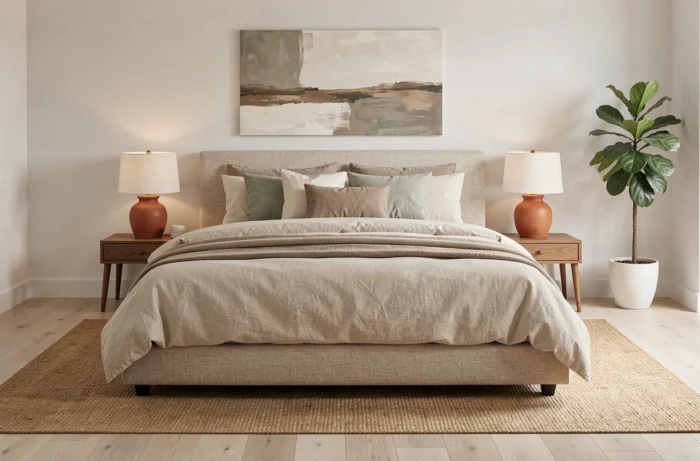
Designing a house benefits from being treated as a technical project as much as an aesthetic one. Air quality, the thermal behavior of materials, and the coherence of light and color room by room form the foundation of an interior that remains pleasant long after the photo session.